As some of you may already know, I’ve been doing my father’s wine labels for a few years now (actually, it’s not just my father’s, I have to say I feel it like my own now ❤️). I tried many different techniques, experimented, and made mistakes, but in the end, it all paid off because we created a perfect label for our small winery.
Therefore, I wanted to share my whole experience with you and give you the best tips.
Before you start, think about your audience…
While you’re considering your design, think about your wine’s identity and who you’re trying to reach. Is your wine a luxurious, high-end product, or is it fun and approachable? Knowing this will guide your design choices, from colors to typography.
Also, understand your audience’s preferences. A younger demographic might appreciate modern, bold designs, while traditional wine lovers may lean towards classic elegance. Consider the emotions you want your brand to evoke; do you want it to inspire a sense of adventure, or perhaps a feeling of relaxation and comfort?
Key elements of a wine label
A well-designed wine label consists of several key elements:
1. Brand name
This should be prominent and memorable. It’s the first thing customers see, so make it stand out with unique lettering or a logo. Your brand name is a crucial part of your identity, so ensure it resonates with your target audience and reflects the essence of your wine. This is the time to be creative! 💡
2. Varietal or type of wine
Clearly state what type of wine is in the bottle. This helps consumers make informed choices and sets expectations about the taste experience. Including the varietal or type will help you highlight the unique characteristics of your wine, appealing to both connoisseurs and casual drinkers.
3. Region
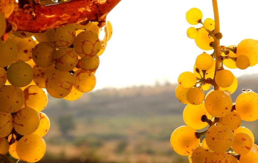
If your wine is from a well-known region, highlight it. This adds prestige and can influence the perception of quality, as certain regions are renowned for their winemaking heritage. Mentioning the region can also evoke imagery and emotions associated with that area, creating a stronger connection with the consumer.
4. Vintage
The year the grapes were harvested. This information is critical for consumers who follow how different weather conditions affect the taste of wine from year to year.
When I first started helping my father with the design of our label, I wasn’t familiar with the importance of this info, but over time I fixed my mistake (and our customers noticed it right away).
Vintage can also convey the age and, potentially, the quality of the wine, appealing to those who prefer aged varieties.
5. Alcohol content

This is a legal requirement in many places. Besides compliance, stating the alcohol content can help consumers make decisions based on personal preference or dietary considerations. This transparency builds trust between your brand and your customers.
6. Back label
Don’t forget to dedicate some time to the back label. This is where you can tell your wine’s story, including tasting notes, food pairing suggestions, and a bit about your winery. This narrative can create a personal touch, making your wine more memorable.
People loved reading about how my father started his winery, and they would discuss it with us any time they had a chance. Sharing your winery’s story can also establish a sense of authenticity and craftsmanship, enhancing the perceived value of your wine.
Pay attention to visual elements
Colors
Choose colors that reflect the personality of your wine. For example, earth tones can convey tradition and nature, while vibrant colors might suggest fun and innovation. Colors have the power to influence mood and perceptions, so select hues that complement the flavor profile and target market of your wine.
Images and Graphics
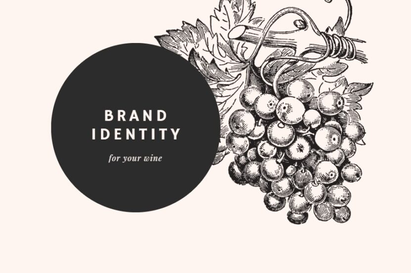
An image or graphic can be a powerful focal point. Whether it’s a minimalist graphic or a detailed illustration, ensure it aligns with your brand’s identity. This visual element can capture the essence of your wine, telling a story or conveying a message at a glance. If you want your wine to represent an elegant, high-price drink – use a more traditional style.
It’s also a chance to differentiate your bottle from others on the shelf.
Typography
The font choice can significantly affect your label’s feel. Elegant scripts can evoke sophistication, while bold, modern fonts might appeal to a younger audience. Typography is an integral part of the design that can enhance the overall aesthetic and reinforce brand personality.
Consider how different fonts can complement your label’s imagery and color scheme to create a cohesive look.
How to Design Your Label?

Step 1 – Start with Inspiration: Look at other wine labels for inspiration. Note what you like and dislike, and think about how to make your label unique.
Step 2 – Sketch Your Ideas: Begin with rough sketches. This helps translate your ideas into visual elements.
Step 3 – Choose Your Software: Professional design software like Adobe Illustrator or free tools like Canva can help you bring your vision to life.
Step 4 – Experiment with Elements: Play around with different layouts, fonts, and color schemes. Remember to keep your target audience in mind.
Step 5 – Get Feedback: Share your designs with friends, family, or colleagues. They can offer valuable insights and help you see things you might have missed. My family members were my toughest judges, but that’s how I learned what was I doing wrong.
FAQs
The Alcohol and Tobacco Tax and Trade Bureau (TTB) requires certain information on a wine label, including the brand name, class or type of wine, alcohol content, net content of the bottle, sulfite declaration, the bottler or importer’s name and address, and the country of origin. The specific requirements can vary, so it’s essential to consult the TTB guidelines when designing your label.
To sum up…
Designing your wine label is a creative process that gives personality to your wine and connects with consumers. Think about your audience and blend art with branding to tell your wine’s unique story. It is a reflection of you and your passion, so don’t rush.
Related Posts:


